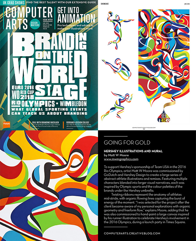
Nice feature in June Issue # 254 of Computer Arts on the Team USA athlete illustrations I created for Hershey's and Go Dutch for the brands Rio 2016 Olympics Campaign. A super fun project in collaboration with great folks. These designs will be getting a lot of play in the next months leading up to the Olympics in Rio. Always a thrill to see campaigns come to life. Go Team USA!

CA – What was the brief for this project?
MWM – To support Hershey’s sponsorship of Team USA in the 2016 Rio Olympics I was commissioned by GoDutch and Hershey Design to create a large series of abstract athlete illustrations and remixes that include multiple characters blended into larger visual narratives inspired by Olympic sports and the color palettes of each brand under the Hershey umbrella.
CA – What's the idea/concept behind the final work? How did you bring the brief to life?
MWM – Each of the character illustrations is comprised of twisting ribbons that become the anatomy of each athlete mid-stride. Organic flowing lines that weave into the next and capture the burst of energy of the moment.
CA – Did you face any unique challenges during the project?
MWM – It was a real honor to be selected for this project. from start-to-finish it was a pleasure to collaborate, brainstorm, develop, refine, and finalize the illustrations. I was selected for the project after the client became aware of my personal explorations with organic geometry and freeform flow. Once we had a green light for the project we had already identified a plethora of reference examples from my portfolio of murals, canvas paintings, and vector designs that share this same energy and organic abstraction, so it was a really smooth design process and I knew exactly what the goals were with each illo.
CA – What's your favourite part of the project?
MWM – For the launch there was a fun event in Times Square last week with a bunch of sponsored athletes in attendance and many of the folks I worked with on developing these designs. For this celebration I was commissioned to hand-paint a large canvas inspired by the runner illustration I had developed in vectors. Working on this painting was a blast. It’s always fun to push the limits of traditional materials and I have never been so precise with a brush and wet paint, striving to capture the same exact precision of the vector graphics. CA.254.
