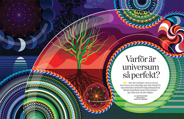
I had a blast designing this cover & feature spread for the September issue of Forskning & Framsteg. The article 'Why is our Universe so perfect?' dives into The Anthropic Principle, how, and why, life is possible here on Earth. The vector graphic artworks I created are inspired by the famous 1888 Flammarion Engraving that beautifully illustrates these concepts. Consciousness, Gravity, Moon cycles, and Space-Time Continuum, aligned as if they are gears in an clock. Another very fun assignment that required me to hit the books and do lots of research before getting started with the artworks. Enjoy!

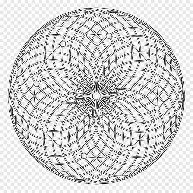
The skeleton of one of the spheres. Appearing on the cover in blues and in feature in reds.

I designed and refined the 2-page spread first, then remixed the elements to work well in the cover framework. I really enjoy the process of integrating an illustration with the masthead, headlines, and bullet points for magazine covers. It becomes a balancing act of form, color, and typography that allows the artwork to shine and also delivers the key messages at first glance.

View past editorial illustrations and covers for Forskning & Framsteg : 1 + 2 + 3 + 4 + 5.
